Branding
•
Web Design
Maxipro (Asia) Limited
Branding, Web Design, Photo Direction
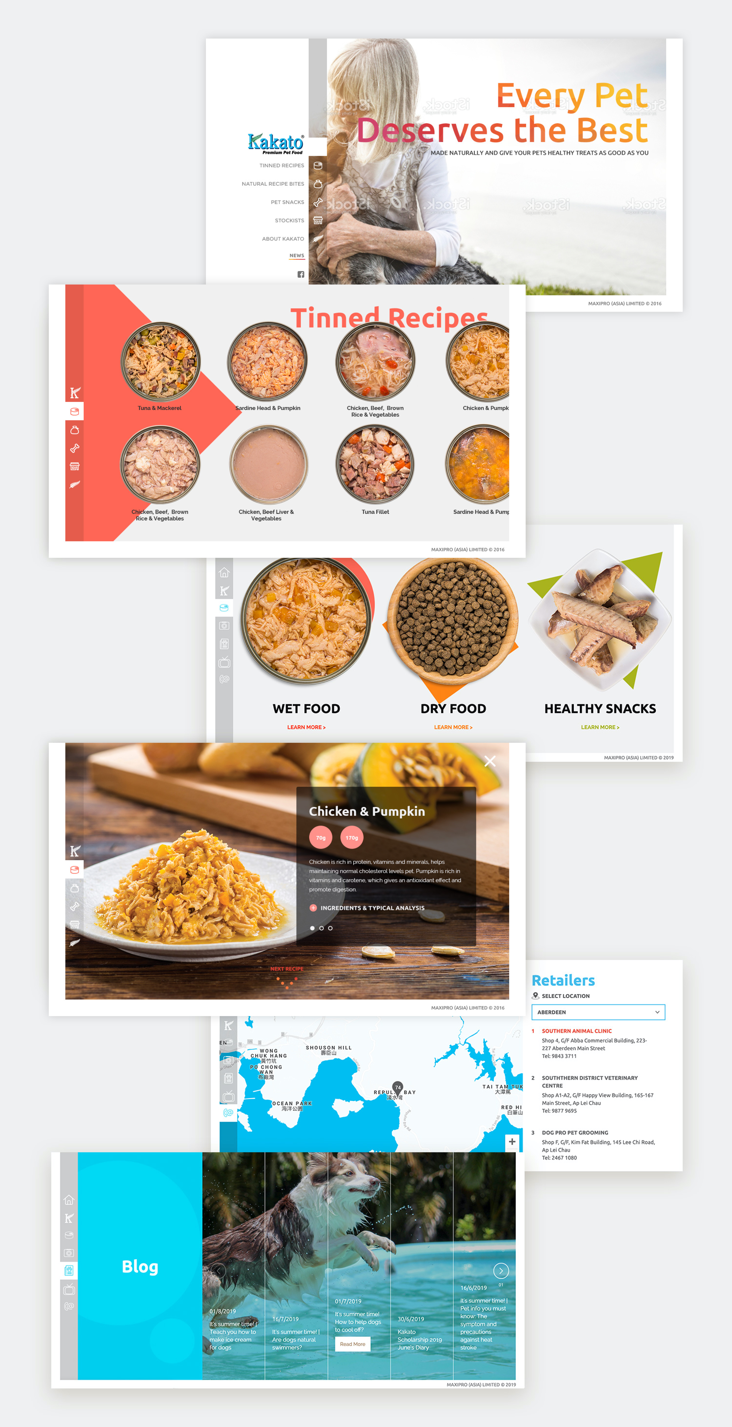
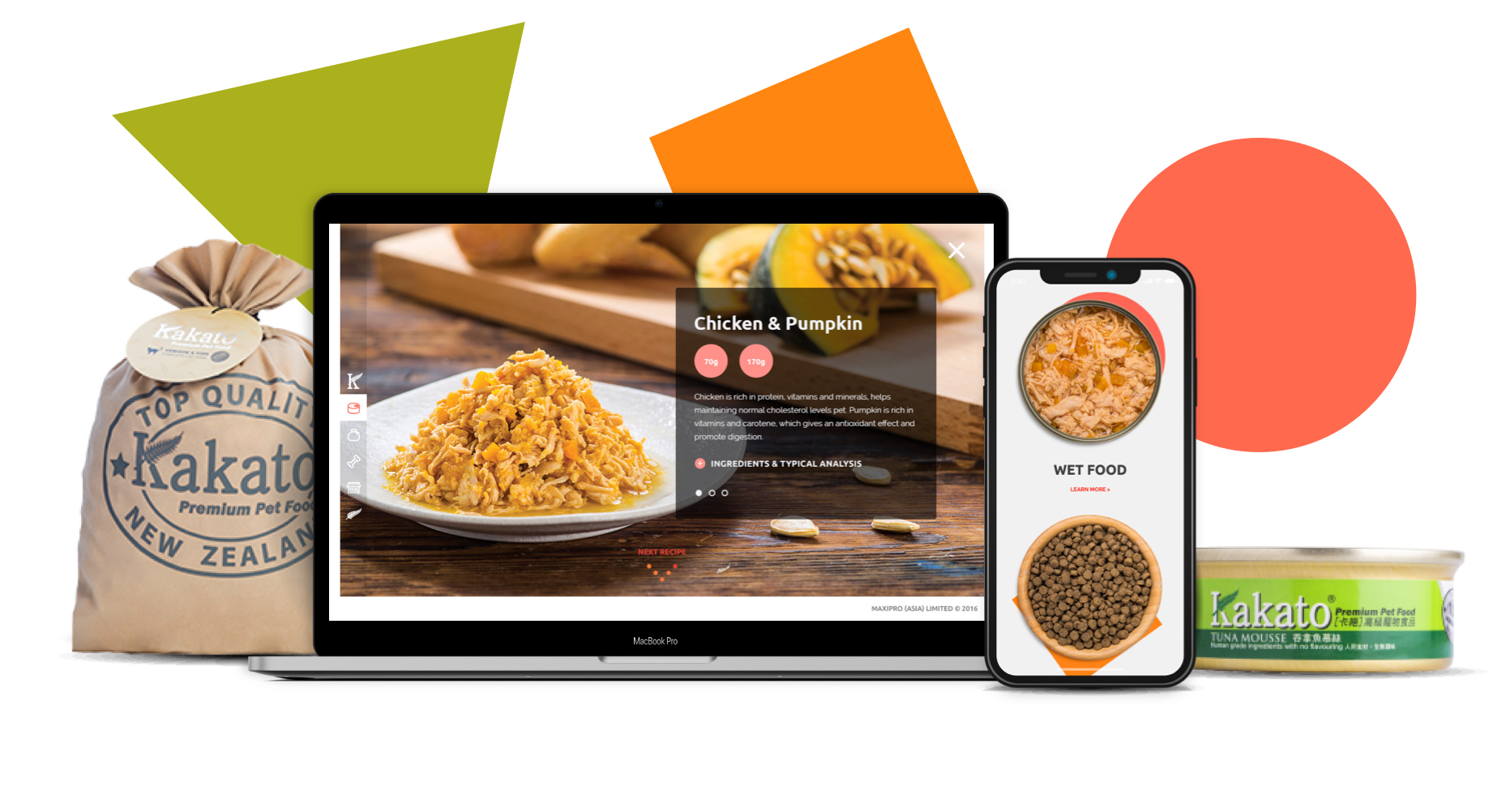
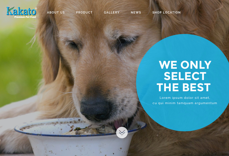
I helped Kakato to develop the official website by redefining the art directions, through creating the new official website with photo directions. The team and I did this by revamping the branding and website and taking new product photos.
Kakato is a well-known pet food brand in Asia and originates in Hong Kong. It has been providing a wide variety of high-quality, delicious, and healthy human-grade canned food, snacks, and gluten-free dry food for pet owners who care about the health of their pets & regarding their cats and dogs as family members.
As a Web Designer, I collaborated with our Software Engineer, Director, Project Manager, and marketing executive to define the project goal and new art direction.
We each had specific responsibilities; my job upfront was to conduct the competitor analysis, assist with photo shooting, design the website and build the branding guideline.
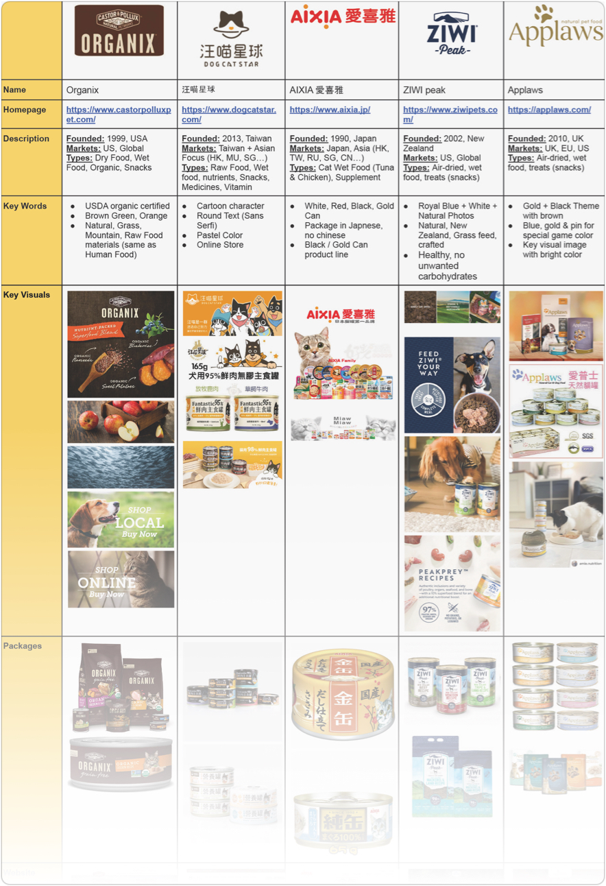
At the first stage, we conducted a competitive analysis. We compared Kakato pet food with other famous pet food websites in Hong Kong in visual, qualitative, functionality, strengths & weaknesses aspects.
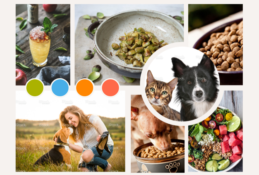
Based on the result of the competitive analysis and the mood board, we discussed with the clients and agreed that we would like to build up the brand with cheerfulness, treating pets as family members, and providing them with tasty and healthy varieties of foods.
We decided to immerse the main branding blue color, with other high-saturation colors which are similar to the pet foods’ cans into the website. Moreover, we would like to make use of simple icons, videos on playing with pets, photos on making the food look like serving on the dining table, and cheerful pets to represent the brand identity. Afterward, we designed a few homepages and inner pages as samples and part of the brandings.
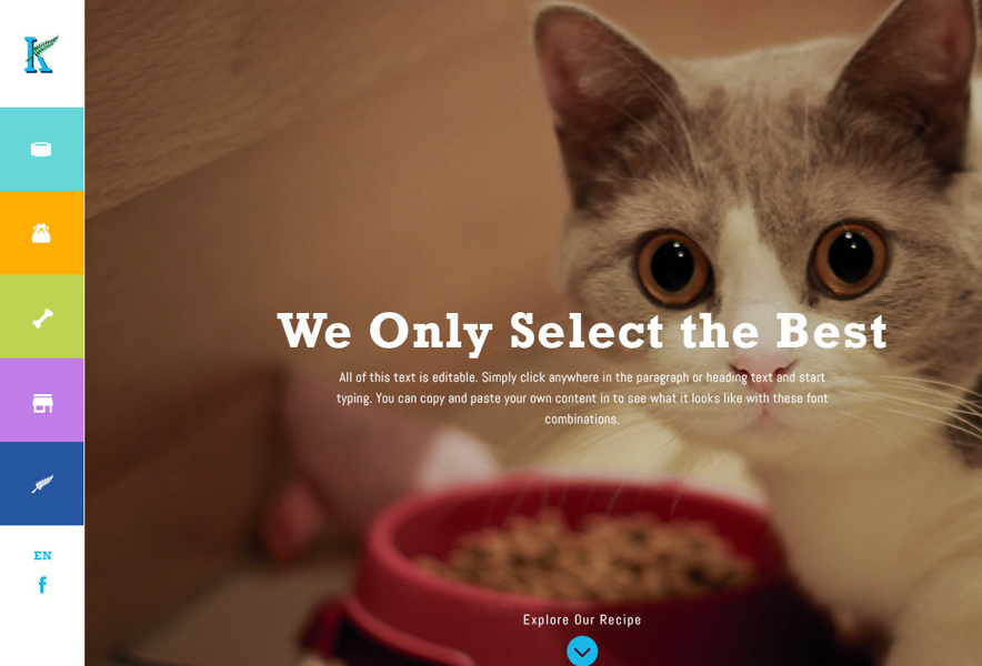
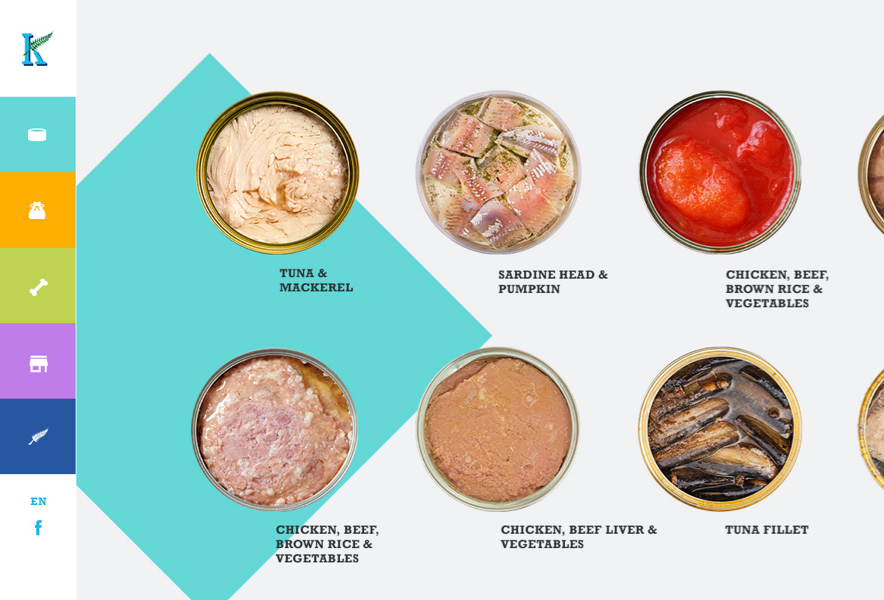
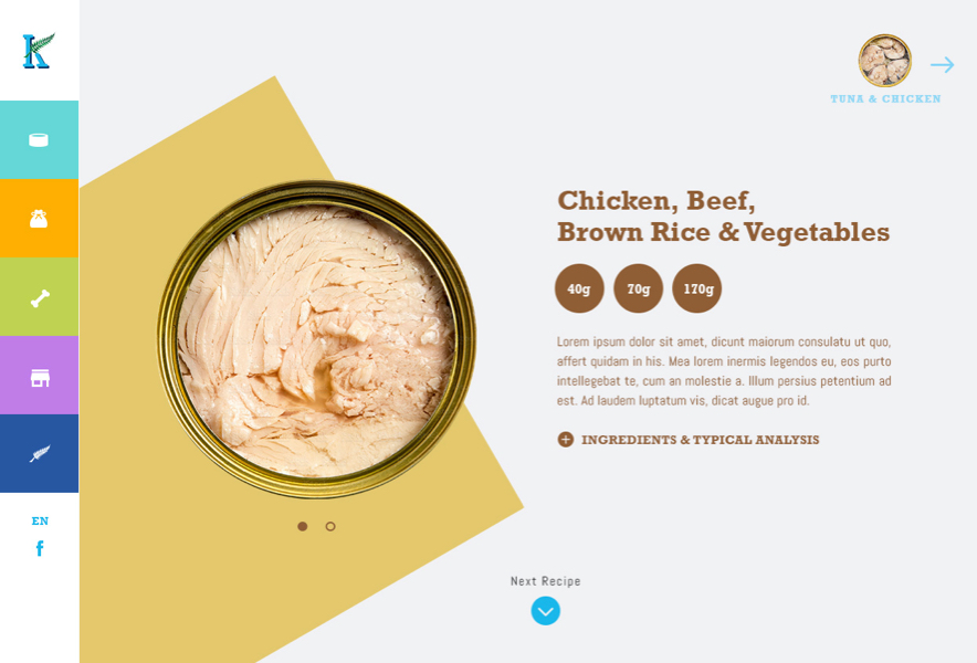
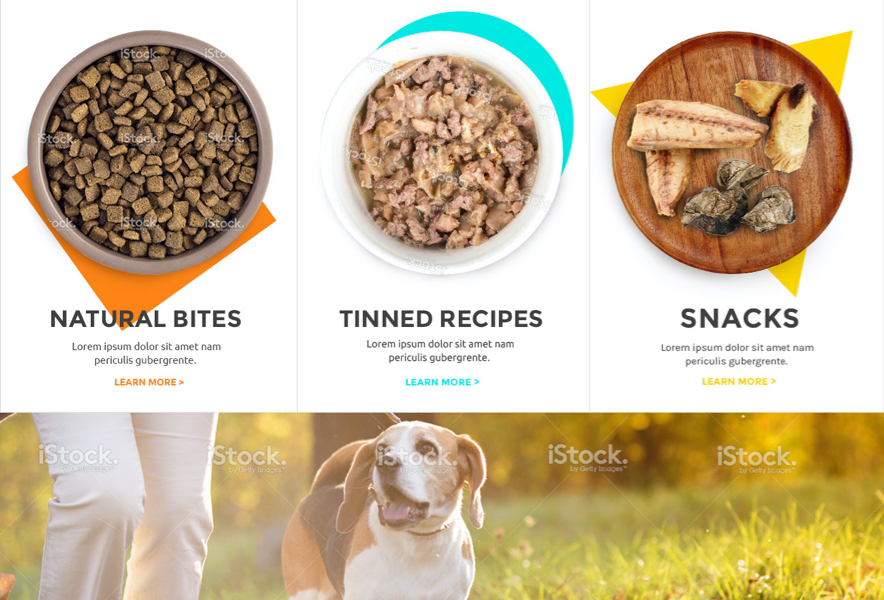
After the art direction was confirmed, we hired professional photographers to shoot the photos for the website in the studio with our clients, directors, and marketing executive. Our approach is to make the food look tasty, freshly made, ready to be served on the dining table, and even safe for humans. Moreover, all the food inside the can is the original real pet food, in order to show the true contents inside the cans.
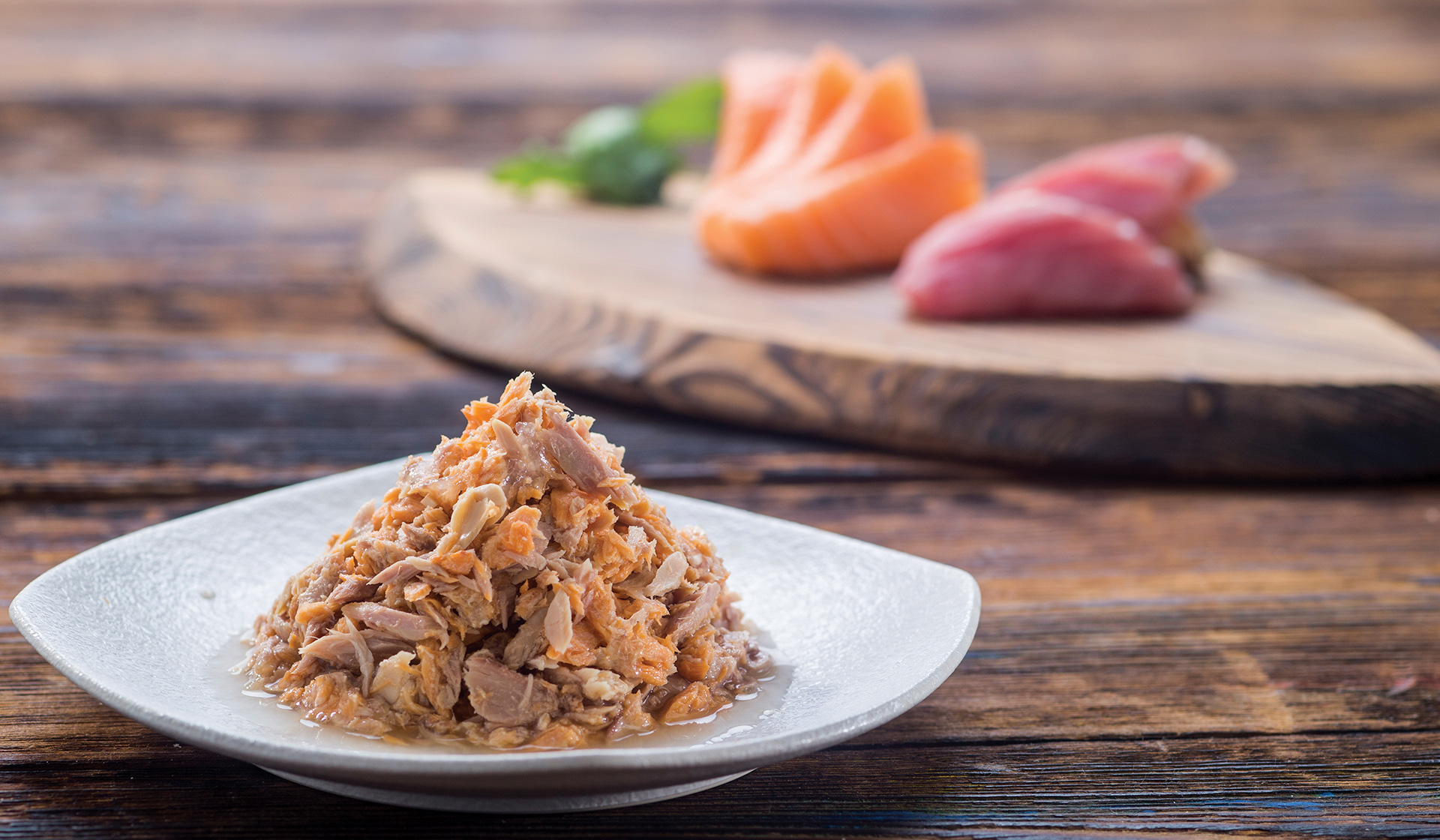
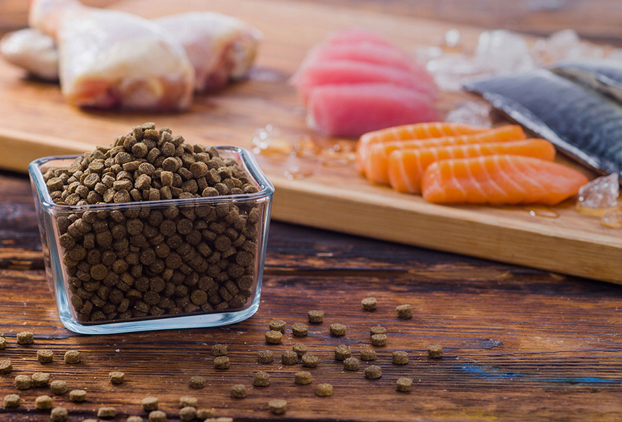
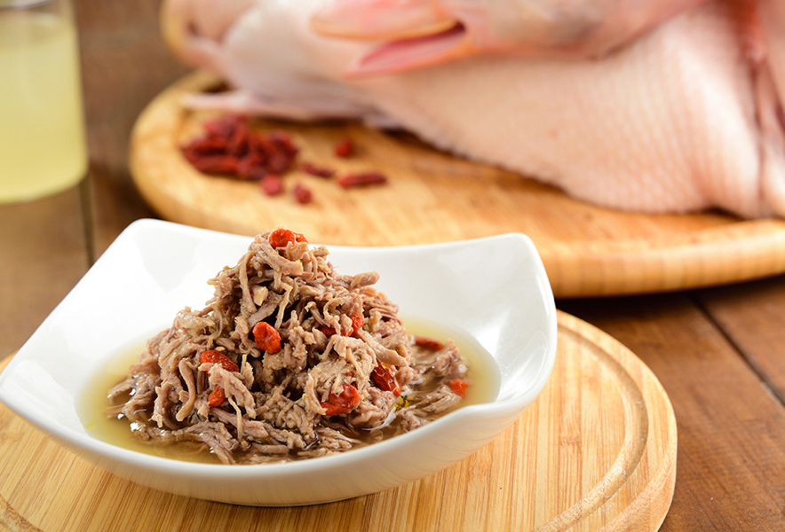
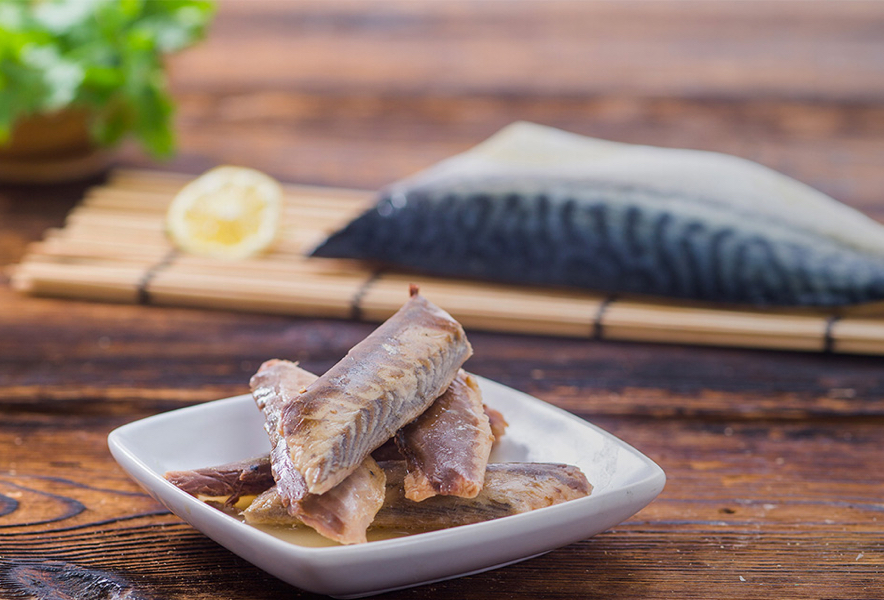
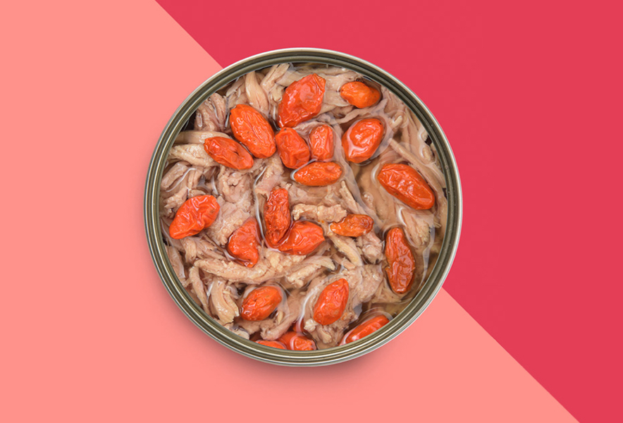
When the photos were shot and ready, we continued designing the homepage. As this project is heavily relying on visual elements, we always showed the high-fidelity prototype to the client. The grayscale wireframes were only to be used within our team.